
J.P. Morgan
Global Private Bank
Building a Unified Global Platform for J.P. Morgan’s Private Banking Services
ROLE
UX Director
company
Bounteous
INDUSTRY
Financial Services
Overview
J.P. Morgan Global Private Bank is one of the world’s leading wealth management and investment firms, helping high-net-worth individuals and institutions achieve their financial goals. With a global client base, JPM GPB provides personalized services in investment management, credit, banking, estate planning, tax planning, and philanthropy.
Before launching a new multi-site, regionalized digital experience, JPM GPB partnered with Bounteous to conduct a comprehensive discovery phase to ensure that their website could meet the diverse needs of both U.S.-based clients and a global audience. As the UX Director, I worked closely with key stakeholders worldwide to create unified customer personas and develop strategies for an intuitive, user-friendly digital journey that aligns with the bank’s prestigious offerings.
Challenges
What I Did
Fragmented Personas: Historically, JPM GPB had two sets of personas—one for U.S.-based clients and another for international clients. The goal was to consolidate these personas into a unified framework that reflected the behaviors, concerns, and needs of a global customer base.
Diverse Global Needs: With customers from different regions, there was a need to balance local preferences while maintaining a consistent, high-quality experience for every user.
Complex Digital Journey: The current site faced several navigation and information architecture issues, which made it difficult for users to find key content. The redesign needed to streamline the user journey and deliver a more intuitive experience.

Unifying the US and IPB personas
UNIFYING GLOBAL PERSONAS
The first step was to bridge the gap between U.S.-centric and international personas. To do this, I conducted a series of workshops with stakeholders across different regions. These workshops were essential for aligning on what characteristics, behaviors, and goals should be represented in a unified set of personas. We focused on:
Identifying shared behaviors and needs across regions
Understanding cultural and financial nuances that might impact digital interaction
Pinpointing how clients interact with digital tools versus human advisors
These personas helped us understand that many JPM GPB clients value personalized content, easy access to expert advisors, and streamlined navigation across financial services. This insight directly influenced the website's content strategy and structure.


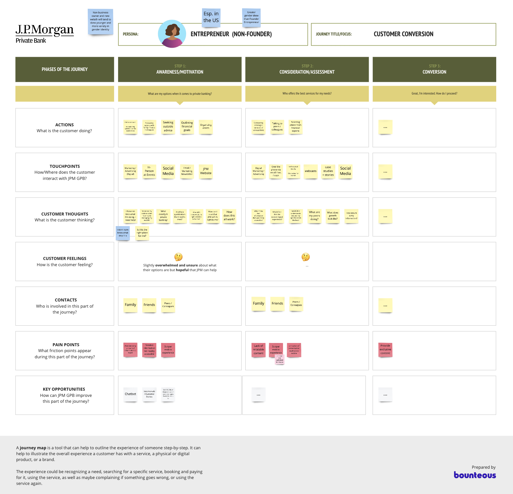
JOURNEY MAPPING & COLLABORATIVE WORKSHOPS
The next step was to map the customer journey for each unified persona. By collaborating closely with JPM GPB stakeholders, we mapped out the digital journey of clients across regions, addressing touchpoints like:
Initial engagement with JPM GPB (discovering services and understanding the brand)
Navigating the website to access information (services, advisors, resources)
Consultation with financial advisors (both digital and in-person)
Post-engagement (long-term relationship management)
We used Miro for remote workshops, allowing teams from around the world to visualize, ideate, and validate the customer journey. These workshops helped identify the pain points in the existing experience, such as unclear navigation and information overload.

Collaborative Miro workshop


Usability Testing & Content Strategy
The next phase of the project involved a thorough UX audit of the current website, conducted in parallel with a content audit by the content strategy team. The audits revealed several major issues:
Lack of Clear Purpose: The site didn’t have a clearly defined goal or user path, which made navigation and finding relevant content difficult.
Navigation and Taxonomy Problems: Users struggled with the way content was organized, leading to confusion and frustration.
Page Hierarchy Issues: The existing hierarchy didn’t support an intuitive flow of information, making it difficult for users to find the content they needed.
To address these challenges, I worked closely with the content strategy team to develop a solution that would improve the site’s usability and streamline user interactions.
USABILITY TESTING
To validate our ideas and ensure that any new navigation structure would meet user expectations, we conducted usability testing using Optimal Workshop’s tree testing tool.
Participants: We recruited 43 participants through Schlesinger Group, 33 of whom completed the test. Participants represented a range of ages, genders, and financial backgrounds. Their investable assets ranged from $150K to $500K, ensuring that the test group was diverse yet aligned with JPM GPB’s target market.
Test Findings:
Misleading Labels: A significant number of users struggled with the current labels, leading to confusion in finding key information. Even though they were often confident in their choices, many failed to find the content they were looking for, indicating that the labels did not align well with the content.
Recommendations:
Be intentional with labels: Labels should clearly reflect the content they represent to improve findability.
Align content and labels: Ensure that pages and subsections are consistent with the labels under which they fall.
Provide visual cues: Incorporate additional clues to help users understand the types of content in each section.

REFINING THE INFORMATION ARCHITECTURE
Using the insights from the audits and usability tests, we refined the information architecture of the site. The updated sitemap consolidated templates, simplified navigation, and ensured clearer labeling and categorization.
Simplifying Navigation: We identified opportunities to reduce clutter and enhance clarity, ensuring that users could easily access the most relevant content for their needs.
Personalization: With a deeper understanding of the personas, we identified areas where the site could offer more personalized content and user flows to make the experience feel more tailored.

Updated sitemap of the redesigned JPM GPB website
Redesigning the Website
The redesign focused on creating a modern, user-centered design that would offer a seamless, efficient digital experience for JPM GPB’s global clientele. Key design goals included:
Elevate the Design Direction: A fresh design direction was created to better reflect the premium nature of JPM GPB’s services while remaining user-friendly.
Enhanced Performance: Optimizing the site for performance and load times was a top priority to ensure a smooth user experience across all devices.
Less Reliance on Imagery: We moved away from heavy imagery to create a cleaner, faster site while still maintaining visual appeal.
Flexible Hero Sections: We incorporated flexible hero sections that could be personalized based on region or audience.
WCAG Compliance: All design elements were crafted to meet WCAG 2.1 accessibility standards, ensuring an inclusive experience for all users.


Results
The preliminary outcomes have already been significant:
Unified Global Personas: JPM GPB now has a clear, comprehensive view of its global customer base, which helps guide both content strategy and digital design decisions.
Improved Usability: The insights from journey mapping and usability testing have led to clearer site navigation, more intuitive labeling, and a streamlined content structure.
Actionable Recommendations: Our findings directly informed the site architecture and content strategy, ensuring that the new website will provide a more engaging and efficient experience for users across the globe.